Form Format Data Types
On the CareVision Management Portal, users will encounter various Data Types whenever they create a new Form Format. These Data Types enable organisation coordinators and administrators to curate specific data that they need from their clients and team members, and are usually intended for reporting and documentation purposes.
Here's a guide to Data Types on CareVision, when and how to use them, as well as matching these Data Types to their ideal Form Category.
Attach Multiple Images
Configuring the data type:
Configuring this data type is easy, you can just give the item a name, any instruction and select the data type. Users are able to upload more than one image to attach to a particular form. For example, a coordinator or staff can attach photos of a Client's prescription or medical test results, as well as photos of their home for Home Safety and other related assessments.
IDEAL FORM CATEGORY: Client Home and Safety Checklist, Client Medical Reports, Client Physical Tests, Incident Reporting, Service and Shift Related Notes
What the data type looks like on Mobile:
When viewing this data type on mobile it presents as a button to add attachments, you can then select the attachments or take a photo from the app
What the data type looks like on Portal:
When viewing this data type on the portal it presents as a button to add multiple attachments.
Completed Report Link
Configuring the data type:
This is used to link completed forms that could possibly be related to the form you're currently on. To configure this form data type you need to select the form format submissions that it can be linked to.
This Data Type is applicable for all Form Categories since linking completed forms might come in handy at any time or instance. One example is where organisations may have an incident report form, and then a separate incident response form you can use this data type on the incident response form to allow it to be linked to the Incident Report form.
What the data type looks like on Mobile:
When viewing this data type on mobile it shows a popup where you can select from the list of completed reports
What the data type looks like on Portal:
When viewing this data type on the portal it shows a list of all completed reports in a dropdown select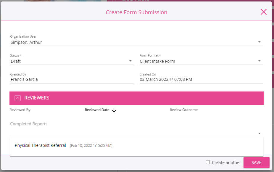
Current Date and Time Button
Configuring the data type:
Allows you to set the date that is needed or required, i.e. date of appointment, date of carer visit, date of assessment. however it presents as a button on the form. This data type was introduced for the use case where staff record phone calls, and during the phone call they need to capture the exact time someone says something, such as accepts the terms and conditions, so that it can be stored with the call recording.
This field is easy to configure, the button will appear with the Name on the button
What the data type looks like on Mobile:
When viewing this data type on mobile it displays as an input field where you can enter the current date and time
What the data type looks like on Portal:
When viewing this data type on the portal it shows 2 buttons, one to capture current date & time and another to reset the value
Date
Configuring the data type:
Allows you to set the date that is needed or required, i.e. date of appointment, date of carer visit, date of assessment.
What the data type looks like on Mobile:
When viewing this data type on mobile it shows as a clickable input field and pops-up a calendar where users can select the date. Display format is YYYY/D/M
What the data type looks like on Portal:
When viewing this data type on the portal it is shown as an input field. Users can click on it and a calendar will popup where they can select the date. Display format is DD/MM/YYYY
Date Time
Configuring the data type:
Allows you to set the date and time that is needed or required, i.e. date and time of appointment or assessment, date and time of carer visit.
What the data type looks like on Mobile:
When viewing this data type on mobile it shows as a clickable input field and pops-up a calendar and after selecting the date, a new popup shows where users can select the time. Display format is YYYY/D/M h:m
What the data type looks like on Portal:
When viewing this data type on the portal it shows 2 input fields, one for the date and one for the time. The date field opens a calendar when clicked where users can select a date. The time field let's users input the time. Display formats are DD/MM/YYYY and hh:mm A (12 hour format)
Draw
Configuring the data type:
Users can use the Draw Data Type to write small notes to be attached to the report. It's also commonly used for signatures, especially if a form requires a signature to be completed.
HOW TO USE IT: If you're using the CareVision portal to draw, just left-click on your mouse then drag. Use the mini toolbar at the top left corner of the Draw window to change your pen color, erase, undo, and save what you just wrote or draw. If you're on CareVision mobile, just use your finger to draw or write on the draw window.
What the data type looks like on Mobile:
When viewing this data type on mobile it displays an area where users can write down notes or draw a signature
What the data type looks like on Portal:
When viewing this data type on the portal it displays an area where users can write notes or draw a signature. Note that after changes, users have to click on the Check icon on the draw window before clicking on the save button
Draw Over Image
Configuring the data type:
This is similar to the Draw Data Type above; however, Draw Over Image allows you to upload an image and draw on it instead of just drawing or writing on a blank space. We've provided a diagram of the human body as an example so that the Client can easily identify or label the affected areas of their body when they're in pain.
HOW TO USE IT: Upon creating a new form, select the Draw Over Image Data Type and add your preferred image. Once it's been uploaded, the user will be able to see the uploaded image, as well as draw on it while they're completing the form.
IDEAL FORM CATEGORY: Client Physical Tests, Client Medical Reports, Incident Reporting
What the data type looks like on Mobile:
When viewing this data type on mobile it displays an area where users can write down notes or draw similar to the Draw data type, the main difference is that Draw over Image has a background image where users will draw over. See notes on how to use this data type
What the data type looks like on Portal:
When viewing this data type on the portal it displays an area where users can write down notes or draw similar to the Draw data type, the main difference is that Draw over Image has a background image where users will draw over. See notes on how to use this data type
Dropdown
Configuring the data type:
WHAT'S IT FOR: Lets you select an option from a dropdown menu. To configure this data type, you need to add the options you want in the field that appears below the data type. As you add each option click enter, and then add the next, they will appear as chips on the configuration screen. When you have added all the options click save.
HOW TO USE IT: Upon creating a new form, select the Dropdown Data Type then input the Dropdown options you'd like the user to choose from. Remember to hit ENTER on your keyboard after typing each option. Otherwise, it won't get saved as a dropdown option.
What the data type looks like on Mobile:
When viewing this data type on mobile it is a clickable field that opens a popup for the options available
What the data type looks like on Portal:
When viewing this data type on the portal it is shown as a dropdown field displaying the options added during creation of the data type
Email Address
Configuring the data type:
This allows you to capture and email address and it validates the format is a valid email address.
What the data type looks like on Mobile:
When viewing this data type on mobile it shows an input field where users can enter an email address
What the data type looks like on Portal:
When viewing this data type on the portal it displays an input field where users can enter an email address
Float
Configuring the data type:
Allows users to input decimal values. Commonly used to record someone's height, weight, and body temperature.
What the data type looks like on Mobile:
When viewing this data type on mobile it shows a field where users can input a decimal number
What the data type looks like on Portal:
When viewing this data type on the portal it shows a field where users can input a decimal number
Header
Configuring the data type:
Lets you divide and organise a form into sections.
What the data type looks like on Mobile:
When viewing this data type on mobile it helps divide forms into sections. See image below, a header for Client Information with its own fields and another header for Coordinator with its own fields.
What the data type looks like on Portal:
When viewing this data type on the portal it helps divide forms into sections. See image below, a header for Client Information with its own fields and another header for Coordinator with its own fields.
Image
Configuring the data type:
Similar to the Attach Multiple Images Data Type, but instead of uploading multiple photos, you're only allowed to upload a single image to the form.
What the data type looks like on Mobile:
When viewing this data type on mobile it shows an Add button that users can click to attach an image to the form
What the data type looks like on Portal:
When viewing this data type on the portal it shows an Add Photo button that users can click to attach an image to the form
Instructions
Configuring the data type:
Allows users to add an instruction box to the form. The Name field will be the title of the Instruction box and the actual instructions should be written down on the Description field
What the data type looks like on Mobile:
When viewing this data type on mobile it shows an un-editable field that displays the title and description of the instructions created
What the data type looks like on Portal:
When viewing this data type on the portal, it is an un-editable field that displays the title and description of the instructions created
Integer
Configuring the data type:
Allows users to enter numerical values required that are not decimal points.
What the data type looks like on Mobile:
When viewing this data type on mobile it shows an input field that accepts integers
What the data type looks like on Portal:
When viewing this data type on the portal it shows an input field that accepts integers
Lookup People
Configuring the data type:
The Lookup People Data Type enables users to easily search for a Client, Staff, Family Member, or Contact within the organisation instead of manually typing their names one by one.
What the data type looks like on Mobile:
When viewing this data type on mobile it displays a clickable field that opens a popup where you can select from a list of lookups
What the data type looks like on Portal:
When viewing this data type on the portal it displays a list of lookups from a dropdown
Multi Line Text
Configuring the data type:
This Data Type allows users to input long descriptions or details that are needed to complete a form.
What the data type looks like on Mobile:
When viewing this data type on mobile it displays an input field where you could enter multiple lines of text
What the data type looks like on Portal:
When viewing this data type on the portal it displays an input field where you could enter multiple lines of text
Multiselect
Configuring the data type:
Multiselect is a bit similar to the Dropdown Data Type. The only difference is that with Multiselect, users are able to tick more than one option as long as it's applicable to the data required or needed.
HOW TO USE IT: Upon creating a new form, select the Multiselect Data Type then input the Multiselect options you'd like the user to choose from. Remember to hit ENTER on your keyboard after typing each option. Otherwise, it won't get saved as a Multiselect option.
What the data type looks like on Mobile:
When viewing this data type on mobile it displays a clickable field that opens a popup with a list of options (checkboxes) where users can select more than one as their choice
What the data type looks like on Portal:
When viewing this data type on the portal it displays a list of options (checkboxes) and users can select more than one as their choice
Radio Buttons
Configuring the data type:
Radio Buttons allow you to see the available options as soon as you access a form. It's also similar to the Dropdown Data Type, but with Radio Buttons users won't need to click on the Dropdown field to reveal the options.
HOW TO USE IT: Upon creating a new form, select the Radio Buttons Data Type then input the options you'd like the user to choose from. Remember to hit ENTER on your keyboard after typing each option. Otherwise, it won't get saved as a Radio Button option.
What the data type looks like on Mobile:
When viewing this data type on mobile it is displayed as title of the Radio button data type followed by the list of radio button options
What the data type looks like on Portal:
When viewing this data type on the portal it is displayed as title of the Radio button data type followed by the list of radio button options
Rich Text
Configuring the data type:
Rich Text lets you enter longer characters that can be formatted to your liking. You're also able to add bullet points, hyperlinks, and images to your text for more accurate documentation.
What the data type looks like on Mobile:
When viewing this data type on mobile it displays the text written with the formatting specified during creation of the data type. Compare this image below to the one displayed on the management portal
What the data type looks like on Portal:
When viewing this data type on the portal it displays the text written when the data type was created
Single Line of Text
Configuring the data type:
Single Line of Text is best used for brief and short descriptions or details that can be read in a single line.
What the data type looks like on Mobile:
When viewing this data type on mobile it it displays an input field that accepts a single line of text
What the data type looks like on Portal:
When viewing this data type on the portal it displays an input field that accepts a single line of text
Time
Configuring the data type:
Allows you to set the time that is needed or required, i.e. time of appointment, time of carer visit, time of assessment.
What the data type looks like on Mobile:
When viewing this data type on mobile it displays a clickable field that opens a popup where users can select the time
What the data type looks like on Portal:
When viewing this data type on the portal it displays an input field where users can input the time. Display format is hh:mm A (12 hour format)
Unique ID
Configuring the data type:
The Unique ID is generated automatically by the system every time a user submits a particular form.
What the data type looks like on Mobile:
When viewing this data type on mobile it is displayed as an un-editable field
What the data type looks like on Portal:
When viewing this data type on the portal it is displayed as an un-editable field
Yes / No
Configuring the data type:
This Data Type can be used for form questions that are answerable by yes or no.
What the data type looks like on Mobile:
When viewing this data type on mobile it is displayed as a radiobutton with Yes or No as options
What the data type looks like on Portal:
When viewing this data type on the portal it is displayed as a dropdown field with Yes or No as options
Related Articles
Building Form Formats
Forms are a huge part of care and compliance and they are here to stay. You can greatly optimize your teams time and effort by being smart with forms, adding workflows to forms and leveraging data points in forms, meaning you get more value from your ...Forms for Specific Service Types Explained
For some types of service there may be a need to collect additional standard information about the service. An example might be a medication service requiring staff to complete a medication checklist recording which medications were administered, in ...Unanswered Fields in Forms
OVERVIEW Unanswered fields in forms refer to those that have not been filled out by users. The options for displaying unanswered fields—Blank, No Answer, and N/A (Not Applicable)—each serve a unique purpose and play an important role in understanding ...Form Associated With Article Content
Goal & Usage Organisation can add content to the community modules and share them with the various members of the community. This can include content about services offerings for clients, news updates to engage teams, and policy or procedure content ...How to Create Forms for Clock In
Clock-in Questionnaires The start of a shift can be the best time for staff members to manage administrative tasks before going about their day. Some organisations require staff to complete a form before clocking-in for a number of reasons including: ...
Request an Article or Guide
We are keen to know what you want to know more about? Let us know on chat or raise a ticket for an article or topic you would like covered in more detail. We have a team of technical writers and learning content creators keen for your suggestions.